 Media Coverage
 Press Release
Exploring Interactive Analytics with Drill-Down Donut Charts
Drill-Down Donut Charts are a common yet very handy feature in Power BI. These charts allow users to visualize categorical data in an interactive drill-down fashion. In this article, we will learn how one can utilize the feature of drill down analytics in Power BI using a 3rd party add-on chart. In as little as 9 Easy Steps, end-users can have the functionality to drill-down or drill-up hierarchically – as required – and view the information relevant to them. This drill-down / drill-up chart visually splits by itself with respect to the available data point in each field of the user’s choosing.
Understanding the Power of Drill-Down Visualization
While this is executed in the same way as other charts used for building visuals, we need to add the ‘Drill-Down Chart’ in our chart list and add multiple columns to the category in the hierarchical order a user sees fit. After this, we can click on the desired portion and see the chart change to the drilled-down details of the succeeding category and so on. To go a step back, we simply need to click on the center of the donut.
Step-by-Step Tutorial for Building Drill-Down Donut Charts
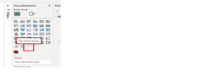
Step 1: From ‘Build Visual’, click the ‘three dots’ to bring up all the options.
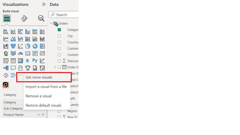
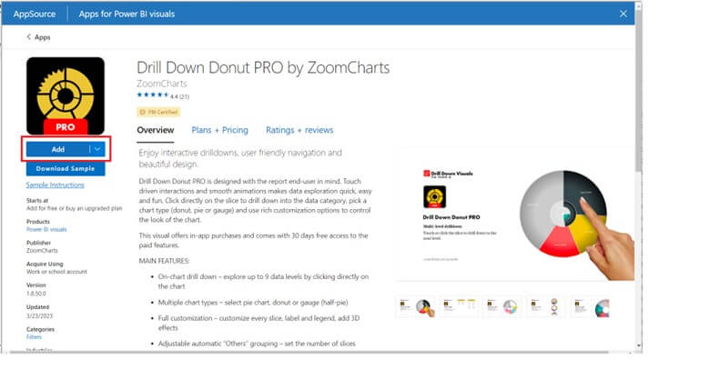
Step 2: Click on ‘Get more visuals’ for a window to pop.
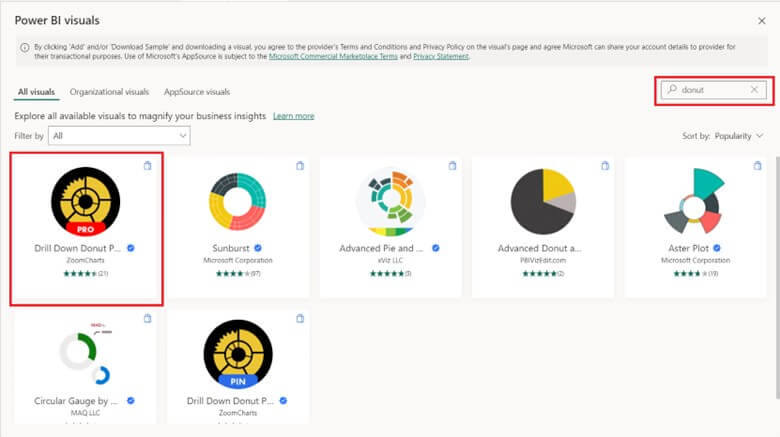
Step 3: In the search box, type ‘donut’ to reveal all the donut-related visuals. Select the ‘Drill Down Donut’ highlighted in the screenshot.
Step 4: After selecting, open the following window and click ‘Add’.
Step 5: Once added, you will find the new visual below the default visuals. Click on the newly added visual and you’ll see the below pane for adding fields (Columns & Measures)
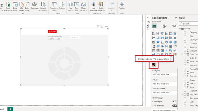
Step 6: Select the required in the hierarchal order along with the needed measures.
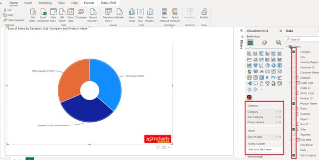
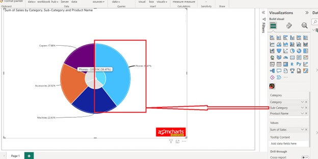
Step 7: You will now see a regular donut chart. However, if you click on any one of the portions it will change into a new donut with respect to the option you choose.
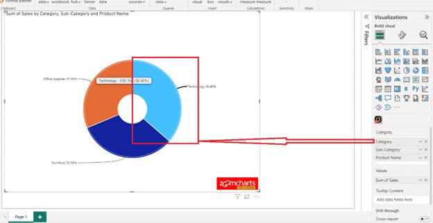
Click further as desired.
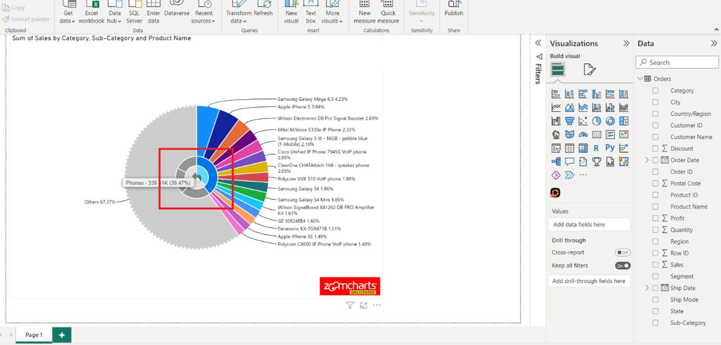
Step 8: Repeat as needed until you get to the maximum granularity you need.
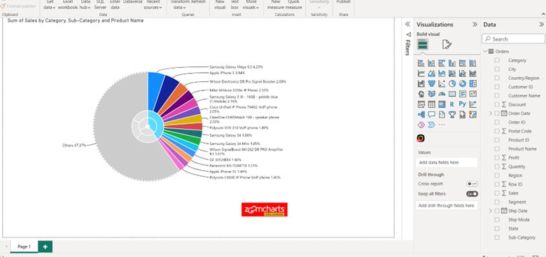
Step 9: Click in the center of the donut chart to go back a step and repeat as needed.
Harnessing the Power of Drill-Down Donut Charts
Integration with Other Visualizations in Power BI Dashboards
This Drill-Down Donut Chart can be used in the dashboard both ways, all by itself and with other charts.