


 Media Coverage
 Press Release
Create Engaging Visualizations with Custom Shapes in Tableau
Shape and color marks are among the most used features in Tableau for creating informative and engaging visualizations. But did you know that you can also combine multiple fields into a single shape legend to create more complex and insightful views?
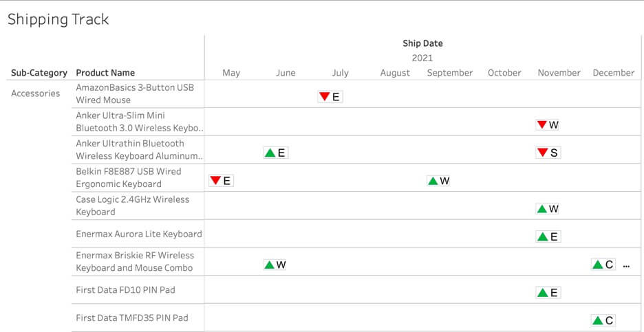
In this blog, I will show you how to do this using a real-world use case of tracking order shipping information with Superstore data. Our goal is to create a timeline view that shows the shipping status of each order, whether it was “Shipped On Time/Early” or “Shipped Delayed”, for each product category. Moreover, we want to use different shapes and colors to indicate the regions where the orders were placed.
Below is the final output of the dashboard. Let me walk you through the steps needed to achieve this visualization.
A Step-by-Step Guide to Integrating Custom Shapes in Tableau
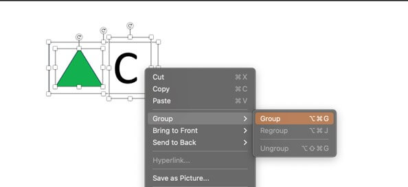
Step 1: Create Custom Shapes in PowerPoint
To begin, we will create custom shapes in PowerPoint to represent our data in Tableau. Using the shape tool, we can easily design a green triangle, the letter “C” (representing the region), and a rectangular border. After creating individual shapes, we will need to group them together as one single shape. By selecting all three shapes and right clicking the shape, you can see the “Group” option. The first shape is created after you click the group option. The subsequent shapes can be created by duplicating the first shape and modifying the letter or color as needed.
Below are all the eight shapes we need for this dashboard. The first four shapes with green triangles represent orders shipped on time in four regions, while the other four red shapes represent orders shipped late in four regions separately.
By right clicking each shape and selecting “save as image”, the eight shapes are saved in our laptop.
Step 2: Load Shapes to the Tableau Repository
Once we have all the required shapes, we save them as images on our local machine. To integrate these shapes into Tableau, we need to add them to the Tableau Repository. By creating a new folder, name it as “Region + Status,” within the “Shapes” directory of the “My Tableau Repository” location, we can organize our custom shapes. After moving the folder containing the saved shapes into the appropriate location, we are ready to proceed.
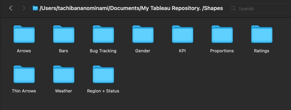
Next, click “Shape” under Marks shelf. In the pop-up window, select “Reload shapes”, the “Region + Status’ folder we added in the repository will be loaded here. Now, when you click the drop-down button, you can see “Region + Status” option in the list of shapes.
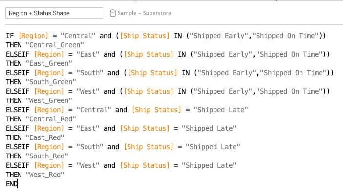
Step 3: Create a Calculated Field
In this use case, we have eight distinct conditions based on the combination of four regions and two shipment statuses (“Shipped On Time” and “Shipped Early” are both recognized as “Shipped On Time” here). We will create a calculated field that captures these conditions. The example below showcases the calculation for this scenario. However, you can tailor the calculation to your specific requirements.
Step 4: Assign Shapes to the Calculated Field
To assign our custom shapes to the calculated field, we need to configure the shape mark in Tableau. By dragging and dropping the calculated field, “Region + Status Shape,” onto the shape mark, we can access the loaded shapes. Opening the shapes, we can assign each shape to its corresponding value. Once we have assigned all eight shapes, we are ready to proceed.
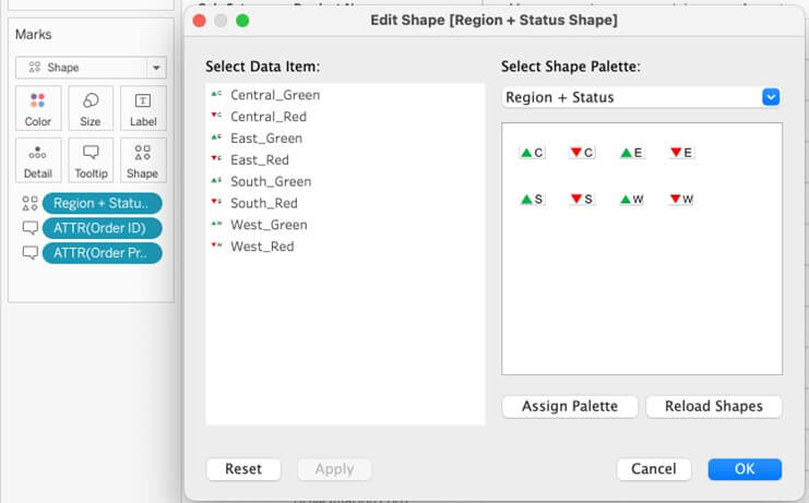
With the shape assignment complete, we can click “OK” to apply the changes. The dashboard will now display the final output. In our example, the red and green triangles represent whether an order was shipped on time or delayed, respectively, while the letter shape represents the region.
Remember, you can further enhance the visualization by incorporating additional fields and conditions based on your specific use case.
Enhancing Data Visualization with Combined Fields and Custom Shapes
Showcase Data Insights with Custom Shape Legends
Unleash the Potential of Custom Shapes in Tableau
Conclusion
Elevate Your Data Visualization Game with Custom Shape Legends in Tableau
Create Complex and Informative Visualizations with Tableau Custom Shapes
Thank you for reading!
