 Media Coverage
 Press Release
Techniques for Conditionally Highlighting Multiple Columns in Tableau
Unlocking the Art of Data Changes with Multiple Column Highlighting
If you’ve ever worked with Tableau to create tables, you’re likely familiar with the ease of conditional cell highlighting for a measure field. You know how effective conditional formatting can help draw attention to key data insights. In this blog, we will explore how we can highlight changes across multiple text and numeric columns in a data table.
Specifically, I will walk you through a step-by-step process to conditionally format multiple columns in a table to visually indicate increases or decreases from the previous column’s values. This can help readers more easily identify notable shifts in trends over time.

In this example below, we want to check if the data varies from the last entry to the current value. If there is a change, we will capture it by highlighting the cell in current columns.
Techniques, Tips, and Best Practices for Making Data Changes Pop
Conditionally Highlighting Multiple Columns for Enhanced Data Analysis
Elevating Insights with Conditionally Highlighted Multiple Columns
Mastering Data Changes Pop with Multiple Column Highlighting in Tableau
Conditionally Highlighting Multiple Columns in Tableau
Enhanced Data Changes in Tableau by Highlighting Columns.
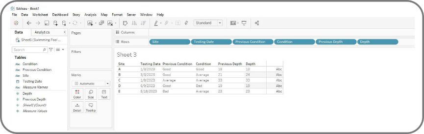
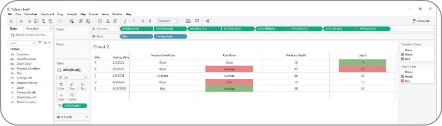
Let’s see the table before highlighting first:
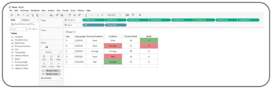
And here is the final output after we apply the highlight:
Now let me show you how we can conditionally highlight multiple Tableau columns in five easy steps:
Step 1
Add dimensions and placeholders to the canvas
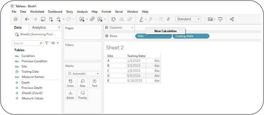
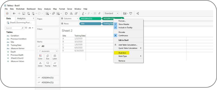
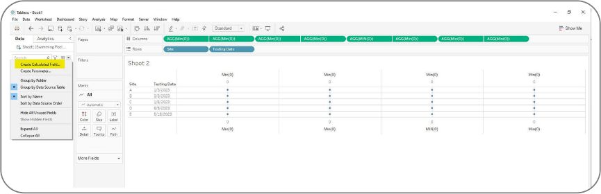
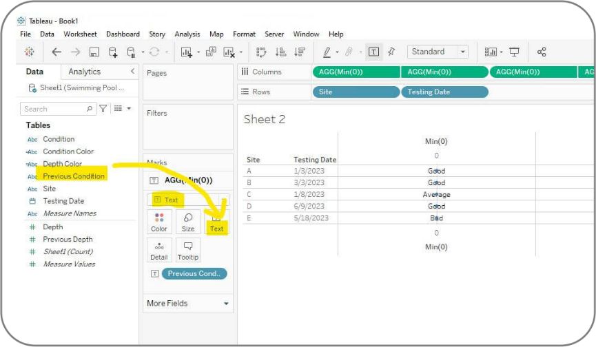
Let’s first drag “Site” column and “Testing Date” column from data pane on the left to the rows shelf. Then, right click the empty space in the columns shelf and click “New Calculation”.
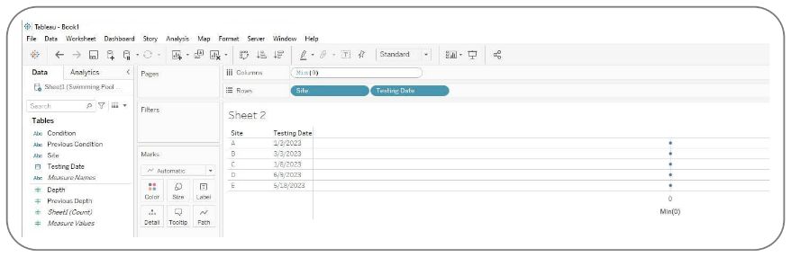
Enter “Min(0)” function here and press return button, our first placeholder is created.
We need to repeat this step to create another “Min(0)” function in the columns shelf. Once it’s done, we right click the second “Min(0)” function and select “Dual Axis”. This step will be used for setting up the column header later.
After this, we get the first placeholder for one of our four columns.
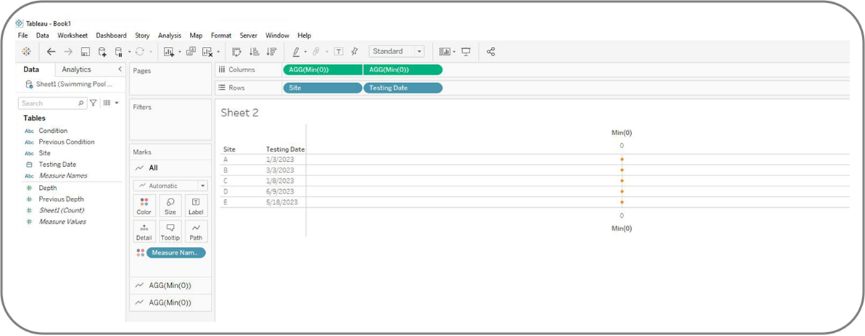
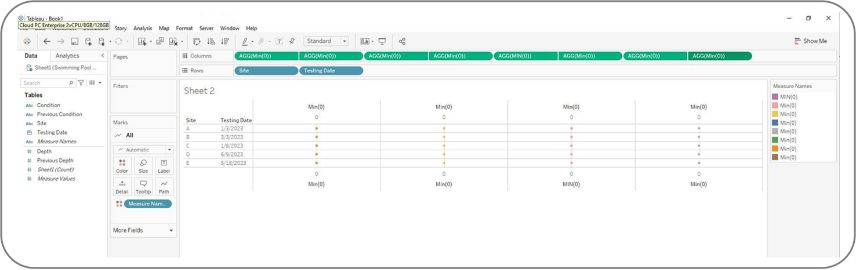
To get placeholders for another three columns, we need to repeat the steps of adding Min(0) functions, creating dual axis. Once you are done, you will see eight AGG(Min(0)) functions in total where each two of them looks like being grouped, and we have four placeholder columns in our table.
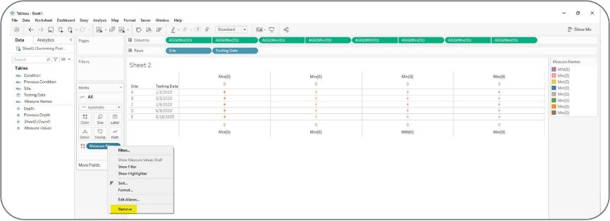
We can remove the Measure name which is automatically placed in the color shelf on the left as we won’t need it.
Now, we are ready for the next step.
Step 2.
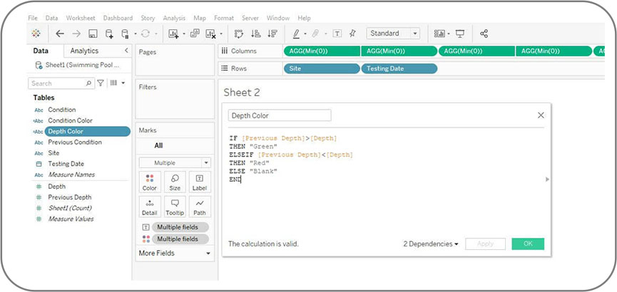
Create calculated fields for highlight conditions
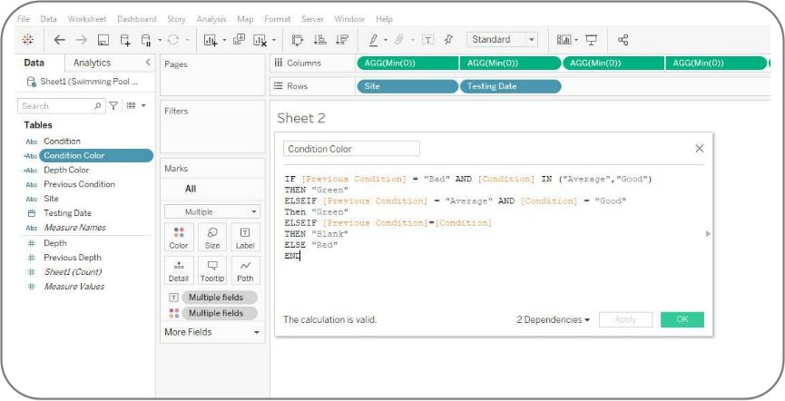
We need to create two calculated fields for capturing the change in depth and condition separately. Let’s create it for condition column first. Click the drop down of data pane and select “Create Calculated Field”.
Name it as “Condition Color”, and type in the calculation. When the condition changes from worse to better, we will use green. When the condition changes from better to worse, we will use red. Otherwise, no color.
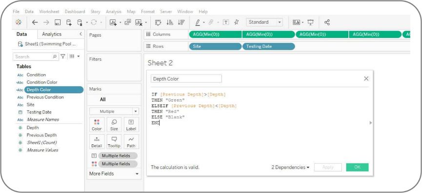
We will also create a similar but easier calculation for depth. When the depth goes higher, we use red. When the depth goes lower, we show green. Otherwise, no color.
Step 3.
Add fields and calculations to the mark cards
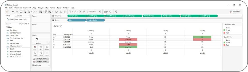
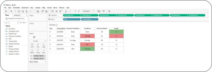
Now, we are going to add the four fields originally from the data sources, and the two calculated fields we just created into the Mark cards separately.
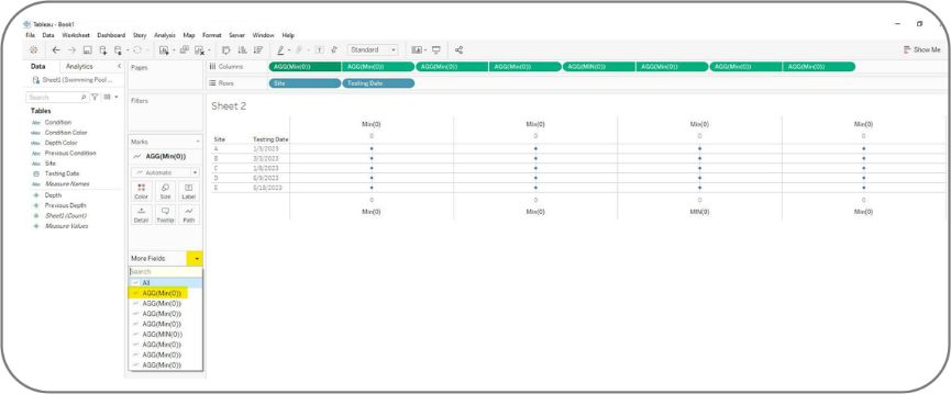
Under the Mark card, click the drop down on the right of “More Fields”, you will see the list of 8 placeholders we previously added. Let’s select the first one and drag “Previous Condition” field to the Label shelf and change mark type from “Automatic” to “Text”.
Then, add “Condition”, “Previous Depth” and “Depth” in the third, the fifth, and the seventh mark cards.
The next step is assigning color to “Condition” column. We move “Depth Color” field to Color Shelf of the fourth placeholder’s marks card and change the mark type from Automatic to Square.

Then, apply the same for the depth field and clean up the format. You will get the view below.
Step 4.
Adjust the axis of placeholders
Next, we need to adjust the axis and clean up the format.
For the axis on the bottom:
- Clear the title, and uncheck the “Include Zero” option
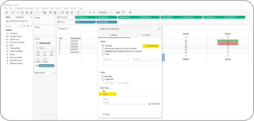
- Under the Tick Marks, we choose “None” for both major and minor ticks.
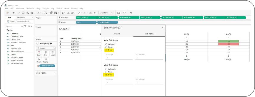
For the axis on the top:
- Rename the title to column header.
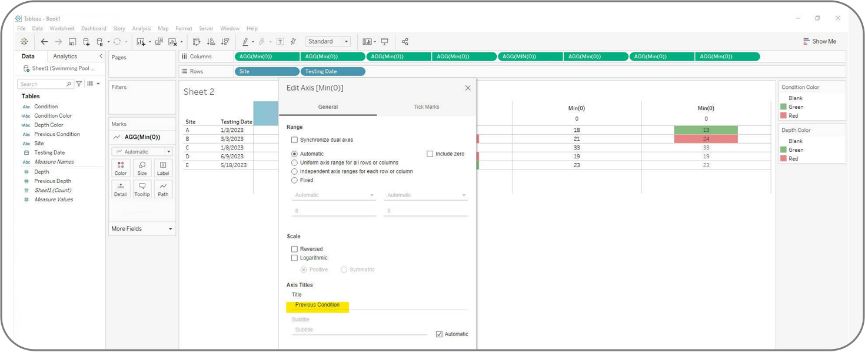
- Then, change tick mark to “None” as well.

- Here is the look after cleaning up the axis:
Step 5.
Final Adjustment
The last step is to adjust the height and width of the cell and remove the grid line. Feel free to format the table as you like, then the table is done! Below is the final output.
And there you have it! Thanks for reading this blog. If you have any questions, feel free to reach out!