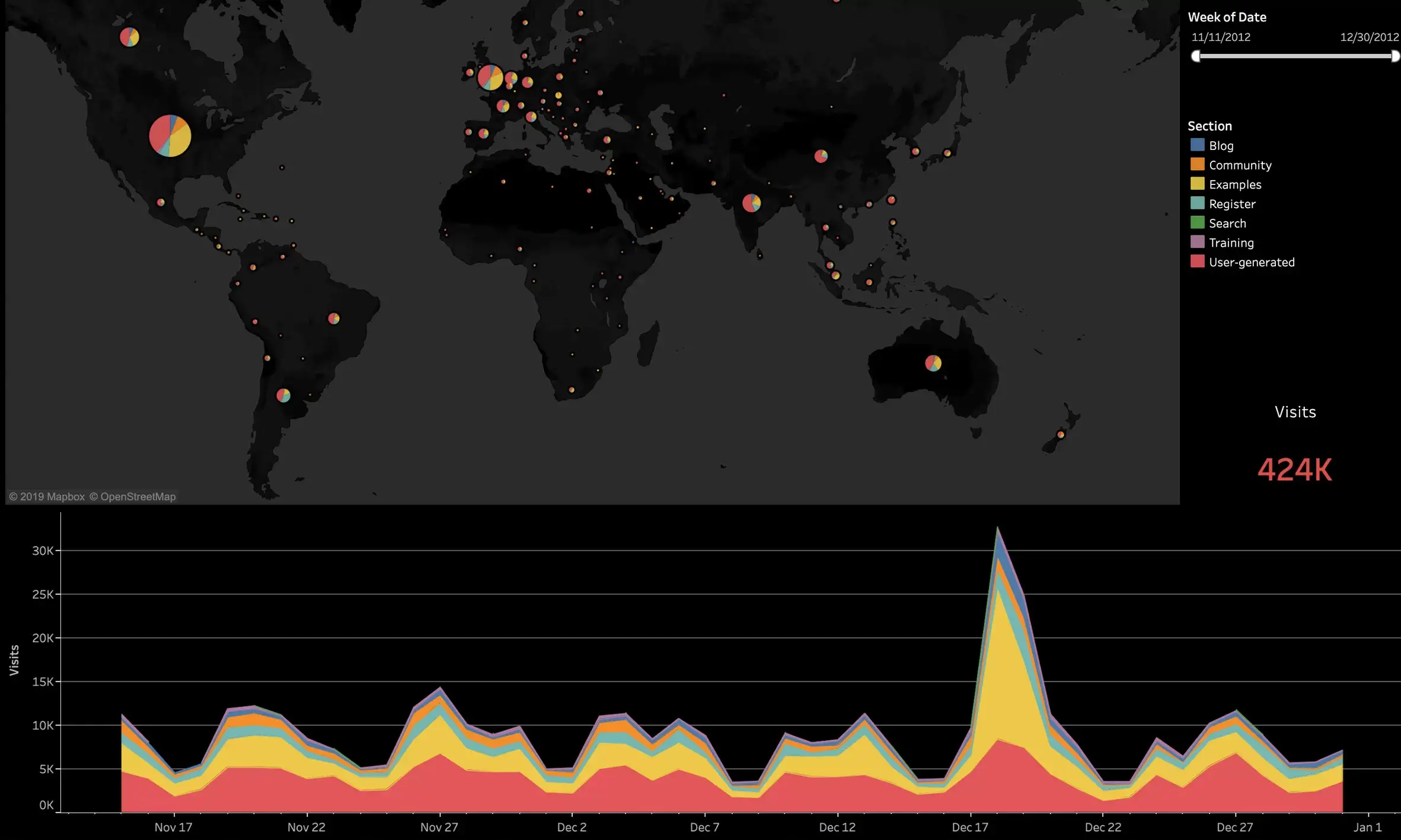
Designing Impactful Dashboards: Strategies for Effective Data Visualization
Whitepaper Insights: Navigating the Art of Dashboard Design with Six Best Practices
Introduction to Effective Dashboard Design: An Overview of Key Considerations
Six Best Practices for Designing Dashboards that Deliver Impactful Visualizations
Tips for Enhancing User Experience and Engagement through Effective Dashboards
Best Practices: Ensuring Success in Crafting Dashboards for Maximum Impact
The Art and Science of Effective Dashboard Design: A Comprehensive Guide
Exploring the Six Critical Best Practices for Creating Impactful Dashboards
Common Challenges and Solutions in Dashboard Design for Optimal Visual Communication
Optimizing Dashboard Workflows for Enhanced Data Visualization and User Engagement
Dashboards are an effective tool for distilling data into actionable insights; still they’re often an overlooked and underutilized tool. In order to see and understand the complete picture and make fast, data-driven decisions, you’ll need to build dashboards that can show you what’s really happening across many sets of data, correlate patterns across multiple metrics, and provide both a summary and in-depth views of performance.
Well-planned dashboards can align your organizations efforts, speed up decision-making, track performance outcomes, and increase ROI. Yet too often, mistakes are made with actual creation of dashboards.
These 6 best practices for creating effective dashboards from Tableau help you build dashboards that can show you what’s really happening across many sets of data – correlate patterns across multiple metrics and provide your with both, a summary and in-depth view of performance.
Get your Whitepaper today!


 Media Coverage
 Press Release