 About Us
 News
News Team
Team Talent Development


 Thought Leadership
 Blogs
Blogs Events & Webinars
 Case Studies
 Video Case Studies
 Whitepapers
 Publications
 Visual Gallery
 Media Coverage
 Press Release
 User Groups
In Part I of this series, I discussed the principles of good design. In Part II, I am going to introduce you to the vehicles that drive those main principles: the five design elements. As was mentioned in Part I, each use-case is unique which means overall design, layout, choice of visualizations, functionality, etc. will vary. Therefore, the use of each design element may fluctuate as your dashboard starts to take shape, but all of them are essential to ending up with a dashboard that is informative, compelling, attractive, and effective.
As a reminder, the idea of this blog is not to provide strict rules or guidelines to designing a dashboard but rather make you, as a developer, aware of what elements are important to focus on. In no particular order, those elements are:
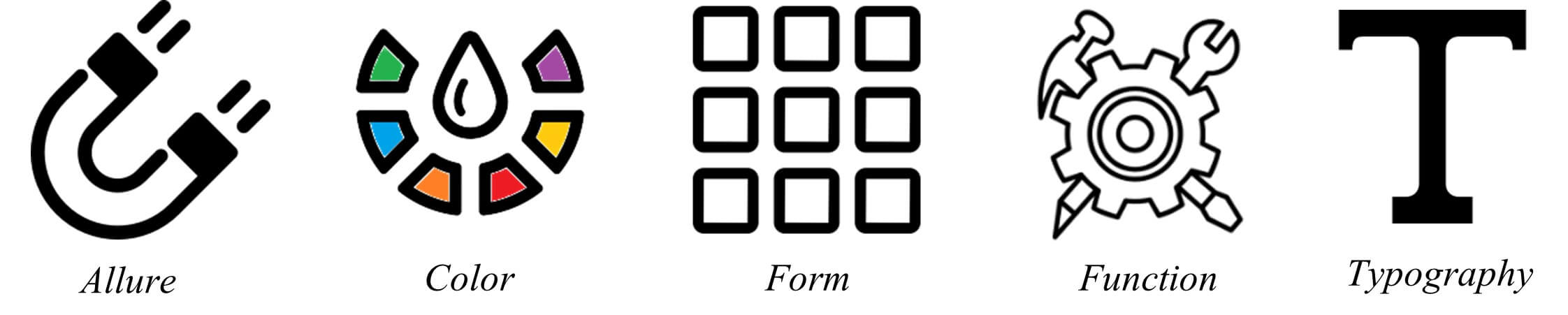
Introduction to Dashboard Design Elements
Keep in mind that a whole blog series could be written for each of the design elements themselves. This blog is only meant to provide you with an introduction to each element. In addition to the information below, here is a dashboard with callouts for each design element and how it was used. After reading this blog post, you will probably be able to spot even more examples in the dashboard.
Allure
The Importance of Allure in Dashboard Design
What draws the human eye? What entices a viewer to want to look at and use a dashboard? The best way to create an alluring dashboard is to focus on human tendencies and the science behind how we see and understand data. It is noted in Colin Ware’s book, “Visual Thinking for Design”, that the average human attention span is only 8 seconds long and that our brain processes visual images 60,000x faster than text. Humans are not computers; we process and understand visual images much faster and easier than text displayed in columns and rows. We also remember this information much better. In a paper written by Michelle Borkin, et al. titled, “Beyond Memorability: Visualization Recognition and Recall”, Michelle and her team determined what components of a visualization attract people’s attention and what information is encoded into memory. The study proved that human recognizable objects such as icons, photographs, and logos help people understand and remember a visualization.
We should keep these points in mind when designing our dashboards and thinking about adding illustrations or icons. If appropriate, adding these objects or replacing other text might not only be helpful to grab a user’s initial attention but can also help to emphasize meanings/trends, additional context or direction, and lead to your viewers being able to recall the important information down the line.
Color
Harnessing the Power of Color in Data Visualization
It can be extremely tempting to want to use all the colors of the rainbow in the visualizations that you create. Color is what makes things beautiful and what makes them pop! However, when used incorrectly, color can also be distracting or even misleading. There’s a delicate balance to using color; keeping it simple is best. Too many colors can create visual overload and impede your users’ analysis while using a single color or too many shades of one color can cause the data to blend.
Color, including all its attributes of hue, shade, tint, and intensity, can convey so much without using words. This is because it is one of those pre-attentive attributes that the human eye picks up on first. (For those who are unfamiliar, pre-attentive attributes are visual properties that we notice without using conscious effort to do so. Pre-attentive processes take place within 200ms after exposure to a visual stimulus, and do not require sequential search.)
Color should only highlight or emphasize the story you are trying to tell with your dashboard. A good test: if you were to grayscale your dashboard, you should still be able to understand your story, you might just have to look at it a little longer and think a little harder. When color is added, you should now be able to understand and interpret the story almost immediately, without thinking.
Ensuring Functional Clarity in Dashboard Design
Another thing to keep in mind when adding color to your dashboard is your audience. You might be thinking, “what does my audience have to do with what colors I use and where?”. Remember, the way you see your dashboard might be different than how another user sees it.
Studies have shown that around 8% of men and 0.5% of women have color vision deficiency (CVD). This is more commonly referred to as colorblindness. The key problem for someone with CVD is that they cannot distinguish between colors as easily as someone without any color vision deficiencies. The two most common types of CVD are generally referred to as red-weak and green-weak or red-green colorblindness but there are many other types of CVD.
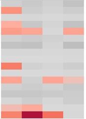
When color is used as the only encoding method in a visualization to make a distinct comparison, it can be difficult for people with CVDs to gather any insight. The example below shows multiple highlight tables colored by negative to positive profit. For someone with no color vision deficiency, they would see the top left chart and be able to easily see the difference between the negative (red) and positive (green) profit. For others, it is much harder:
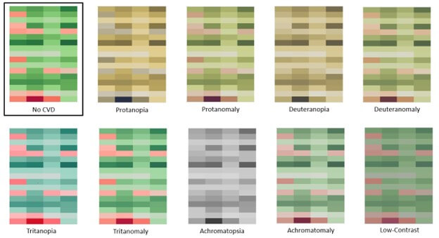
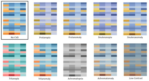
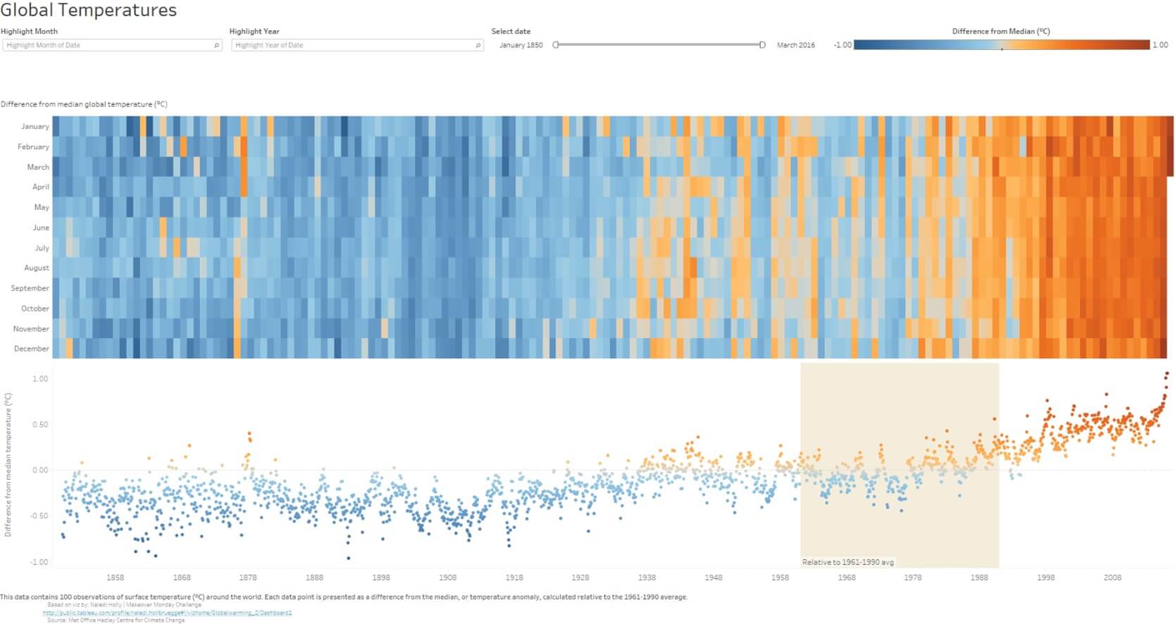
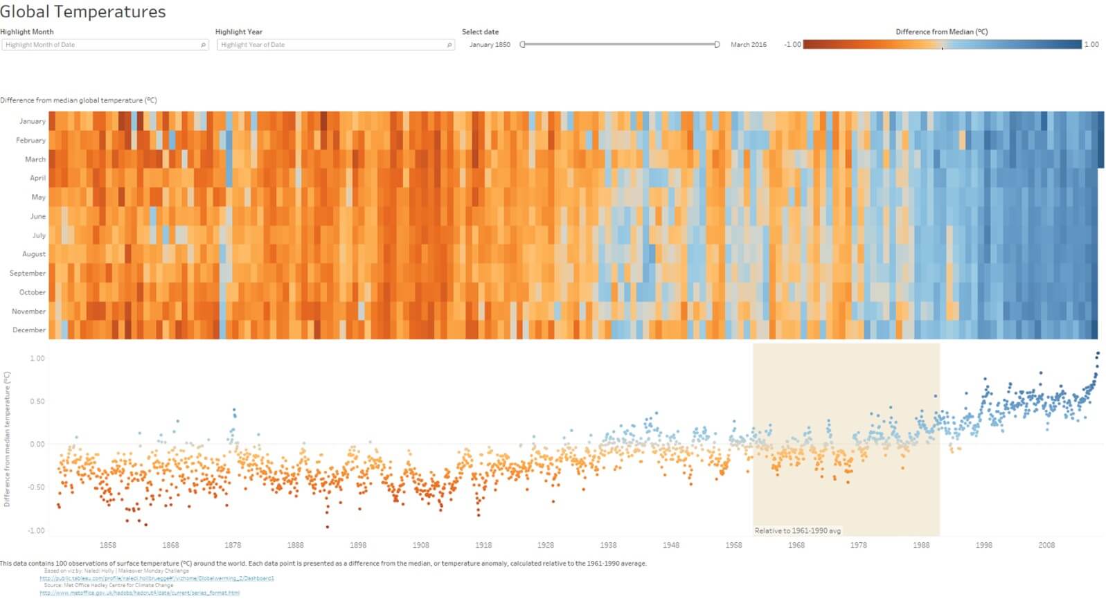
Using red and green might seem like the best solution but this is the exact reason why the default color palette in Tableau is an orange-to-blue diverging palette. It is because it is CVD-friendly. Notice the difference below:
If you have requirements from the business or need to use colors that are within a certain palette, you have two great options:
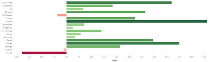
1). Give a secondary encoding method (length, orientation, shape, etc.) along with color to distinguish between negative/positive, good/bad, etc.
For example, the bar chart below uses red and green to indicate negative and positive values, but it also uses direction to do so as well so that those with any CVDs can still gather insight rather easily.
2). Simplify the visualization to focus on one side of that spectrum. Maybe just do a red-gray palette to bring more attention to the negative or bad profit. Or reverse, bring more attention to the green squares.
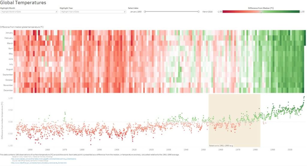
Using color doesn’t just come down to red-vs-green, good-vs-bad. Color association and color psychology are critical as well. Make sure to use intuitive colors that make sense to the viewer to allow them to process the information faster. An example, if you’re working with temperatures, you can use orange to indicate heat/hot and blue for cold.
1). Good example of color association where blue indicates cooler temperatures and orange indicates warmer temperatures.
2). Bad example of color association because it is now reversed from above and can be misleading/confusing.
3). Bad example of color association because there is no color association to temperature when using red to green.
There are numerous studies on color psychology that research what colors impact moods, feelings, and behaviors. How you use colors has a serious effect.
Another added factor is being aware of culture/regional differences when it comes to color. For example, in Chinese culture, red symbolizes happiness and good fortune – the opposite of how American culture perceives red. So, knowing your audience is important not just for what story you are telling but it can come down to your color selection as well.
Form
Optimizing Form and Layout for Effective Dashboards
Our brain is wired to see structure, logic, and patterns because it helps us make sense of the world (even when there is none). In the 1920s, a group of German psychologists developed a theory of how people perceive the world around them. From this, the Gestalt principles were born which center around the idea that the human brain will make sense of complex images consisting of various elements by subconsciously organizing the parts of the images into an organized system.
We can capitalize on these human tendencies by keeping the following in mind:
- Columnar, row, or grid-based structure/layout
- Location of the most important information or visualization that holds the key message(s) (check out Tableau’s Eye Tracking Study)
- Location of user-input options (filters, parameters, etc.)
- Location of instructions, titles, legends, etc.
- Spacing between visualizations (make sure not to overcrowd the dashboard)
- Order and sorting of the data itself (whether it’s numeric, alphabetical, or sequential)
Initial reaction upon viewing a dashboard is very informative. When you see a dashboard (or any form of infographic/illustration/etc.) with bad form, you might not know exactly what is wrong, but you know something is off. If you are unsure of how to engage or where to look, which filters/parameters affect what, and which legends are associated with what visualizations, etc., then the form should be improved.
Just look at the two dashboards below. Both have the same data, information, number of visualizations, titles, etc. but their layout and location of objects on the dashboard have been adjusted resulting in a drastic difference in how the user will react to the dashboard.
The Impact of Form in Dashboard Design
Leveraging Gestalt Principles for Effective Data Presentation
Importance of Structured Layout and Organization
Enhancing User Experience with Thoughtful Placement of Elements
Dashboard #1: Bad example of form
Dashboard #2: Good example of form
So, the next time you look at a dashboard, infographic, website, etc., take a second and think about the form. You will notice that your eye will start to pick up on things that just seem off.
Function
Functionality in Dashboard Design
It’s easy to get excited and want to cram your dashboard with every possible relevant view but go back to what you had planned on in the sketching/whiteboarding stages of development (detailed in Part I of this blog series) and think about the scope. Determine what is the purpose of the dashboard and focus on only the relevant information.
Visual clarity and the big picture can get lost if there are too many views/objects/options for an end user on the dashboard. As a developer, if you find that the scope of your story needs to grow beyond what you currently have but you’re worried you are going to jeopardize the clarity of this one dashboard, there’s an easy answer. You can always create more dashboards.
Each individual dashboard should have a focus. Therefore, every element on the dashboard (visualization, filter, title, legend, tooltip, reference line, etc.) should serve a purpose, otherwise, it is just noise. If you find that two pieces of your dashboard are serving the same or similar purpose, one of those is most likely not necessary.
Streamlining Dashboard Content for Clarity and Focus
Enhancing User Interaction with Filters and Actions
Promoting Effective Use of Filters, Parameters, and Legends
The elimination of clutter and non-relevant information will streamline a dashboard and make it easier to understand and use. The elements that remain will all serve their own purpose or function.
There are ways that you can add or make existing functionality more effective or easier to understand for your viewer as well:
- Make filters, parameters, etc. available on the dashboard in a neat and organized manner to encourage use.
- Add dashboard actions (filter, highlight, set, parameter, etc.) to encourage users to make selections in the charts themselves.
- Make users aware of filters, parameters, highlighters, legends, and available actions by using more prompting language in the titles/subtitles. For example, “Select a Region” or “Hover to highlight by Category” is much more inviting than just “Region” or “Category”.
Removing Clutter and Noise for Improved Dashboard Experience
There are also ways of removing clutter and reducing noise on a dashboard by elevating the function of an individual object. For example, take the following visualization. It is a simple executive overview dashboard focusing on profitability across the United States & Canada. This dashboard is by no means bad, but one thing stands out to me as a bit confusing. The orange to blue diverging palette tells me that profit ratio is ranging from -50% to 50%. That looks to be fixed at those values for the map because the filter above it only goes from -33% to 37% causing confusion. Also, what does orange and blue represent for the area charts below? After looking at it further, the area charts are split into unprofitable vs profitable, but they do not range in color like the map does.
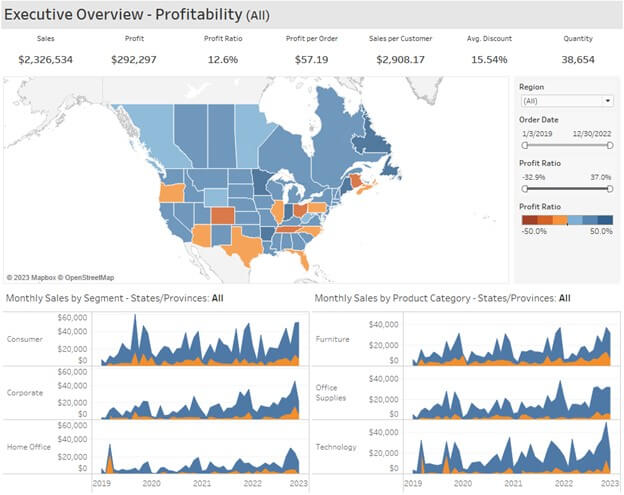
To add some clarity and reduce overall clutter, I am going to make some slight changes:
- Remove the default legend for Profit Ratio.
- Add a subtitle to the dashboard title and color it to provide context for the rest of the dashboard.
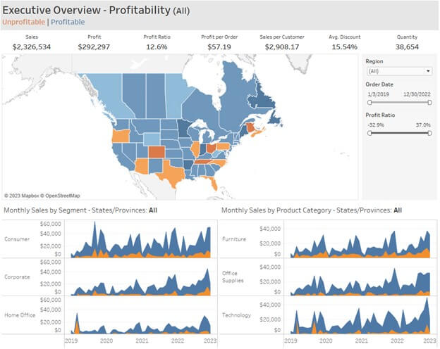
Just two small changes and now the subtitle serves the purpose of adding clarity and context for the rest of the dashboard while also reducing clutter.
Typography
Typography plays a critical role when it comes to how your dashboard/report is perceived, understood, and how it holds a viewer’s attention. Much like colors, there is a lot more communicated through your typography choice than just the letters/words on the screen.
Step away from thinking about dashboards for a minute and think about when you visit a website. Websites are intended to communicate and inform their viewers of whatever their message/product/etc. may be and how they leverage that medium is crucial. Focusing on only the typographical choices, The Wall Street Journal website looks a lot different than BuzzFeed. WSJ has a more overall serious tone to its site versus BuzzFeed which has a more playful or fun vibe. That is intentional.
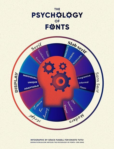
The infographic by Grace Fussell shown below perfectly illustrates how different font types can result in different perceptions.
Not only can typographical choices alter perceptions, but they can help to foster harmony throughout the dashboard. Using the same font for similar or related content provides continuity. The alignment, proportion, orientation, etc. of fonts can help with the organization and neatness of your dashboard (the form). It can also provide a sense of hierarchy or emphasis where needed. For example, the relationship between titles and subtitles, headers and labels, major and minor tick marks on an axis, etc. Seeing a subtitle with larger and bolder text than the title itself would be off-putting; it might seem like an obvious design choice, but it is clearly intentional and critical to the overall result.
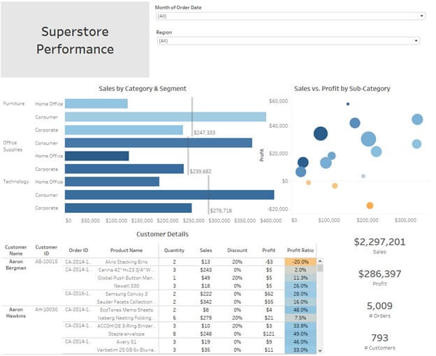
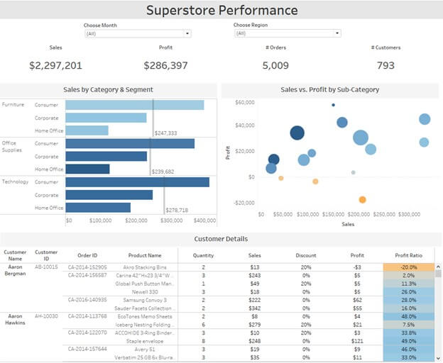
Additionally, keep in mind the Data to Ink ratio. Take the two dashboard KPI headers shown below. The first one shows five separate metrics from left to right with the name of each metric in bold and bigger font than the actual metric itself.

While it is informative, this emphasizes the wrong part. We want to emphasize the data and bring that to the front. So, by just adjusting the font size and boldness, we can reverse that Data to Ink ratio and focus on the actual metrics themselves (in example below). Now, the metric is bolded and bigger than the label. My eye now goes towards the data rather than the label first.

As mentioned in Part I of this blog series, it is understandable how all of this can be a bit overwhelming. Designing and updating a dashboard is an iterative process. You don’t just wake up one day and create the perfect dashboard on the first try. It takes time and effort. The key is to be aware of the best practices and keep them in mind. This will help you develop good habits that make the process easier and more instinctive.
