 Media Coverage
 Press Release
Raw data is of little use. It’s often messy, noisy, incomplete, and extremely difficult to work with. And if you are tasked with extracting meaningful insights from it, you may as well give up and save yourself from the frustration. I should know, I recently worked on a project where the data was unbelievably messy and unorganized.
That’s why in this blog post, I want to show you how to use Python, a powerful and popular programming language, to perform effective data cleaning on your disorderly datasets. My goal is to help you prepare your data for creating stunning and insightful visualizations and tell compelling stories.
What is Exploratory Data Analysis?
Exploratory Data Analysis (EDA) is an approach used in data analysis and statistics to summarize, visualize, and understand the main characteristics, patterns, and relationships present in a dataset. It involves the initial examination of data sets to identify trends, patterns, anomalies, and potential insights before formal modelling. EDA is often one of the first steps in the data analysis process and is crucial for gaining a deeper understanding of the data and guiding subsequent analysis.
Why EDA Matters?
EDA serves as the cornerstone of data analysis and is essential for several reasons:
- Data Quality Assessment: EDA helps identify inconsistencies, missing values, and outliers that can affect the quality of analysis and results.
- Understanding the Data: EDA helps you understand the complications and specifics of your dataset, setting the platform for informed decision-making.
- Spotting Patterns: EDA helps you identify hidden patterns and relationships within your data, shedding light on potential correlations and trends.
- Feature Selection: By understanding the distribution of features, you can make informed decisions about which variables to include in your analysis or model.
- Visualize Data: EDA provides opportunities for creating informative and visually appealing visualizations to communicate your findings effectively.
Steps Involved in EDA
EDA typically involves several steps, each contributing to a comprehensive understanding of the data:
Importing Essential Libraries: Start by importing key libraries such as pandas, numpy, matplotlib, and seaborn:
- Pandas: Pandas provide data structures like DataFrames and Series that allow easy manipulation and analysis of data. It offers functionalities for data cleaning, transformation, and aggregation.
- Matplotlib: Matplotlib is a versatile 2D plotting library that enables the creation of various types of visualizations, including scatter plots, histograms, line charts, and more.
- Seaborn: Seaborn is built on top of Matplotlib and offers a higher-level interface for creating attractive statistical visualizations. It simplifies the process of generating complex plots.
- NumPy: NumPy provides support for large, multi-dimensional arrays and matrices of numerical data. It’s essential for performing mathematical and statistical operations.
Loading the Data: Load your dataset into a pandas DataFrame using pd.read_csv() or equivalent functions.

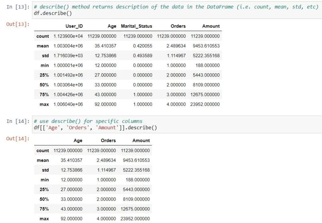
Basic Data Overview and Cleaning: Use commands like df.head(), df.info(), df.isnull().sum(), and df.describe() to gain initial insights into your dataset’s structure and content.
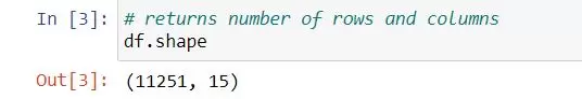
- shape will display the number of observations(rows) and features(columns) in the dataset.
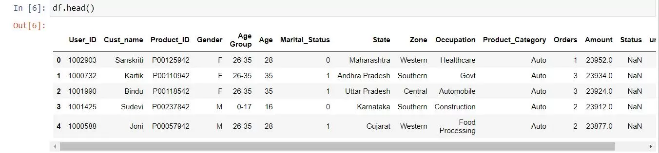
- head() will display the top 5 rows of the dataset.
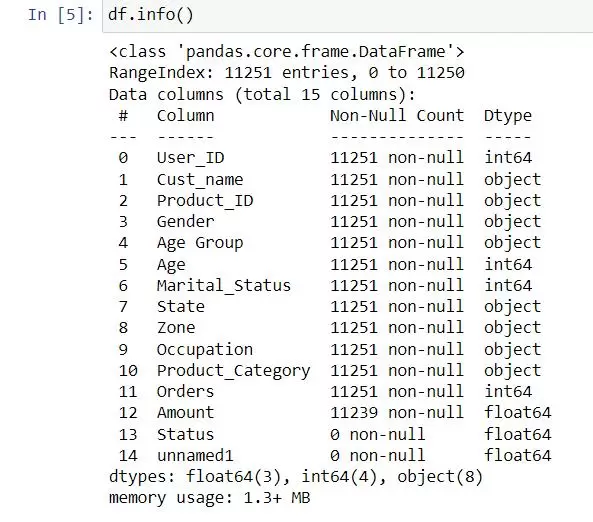
- info() helps to understand the data type and information about data, including the number of records in each column, data having null or not null, Data type, the memory usage of the dataset
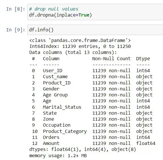
- drop() Some columns or variables can be dropped if they do not add value to our analysis. In our dataset, the column Status and unnamed1 have null values.

Before making any significant changes to the data, ensure that you communicate with your customers/business. Ask the user to confirm whether they want to drop the specified columns. If the customer confirms, the specified columns can be dropped using the drop() function. If not, no columns are dropped. This way, you’re involving the customer in the decision-making process and ensuring that any data changes align with their expectations and requirements.
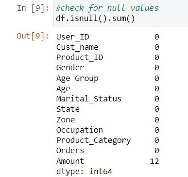
- isnull() is widely used in all pre-processing steps to identify null values in the data. In our example, df.isnull().sum() is used to get the number of missing records in each column.
It’s important to understand whether null values are truly missing data or if they hold a specific meaning in your analysis. When performing aggregation, you need to decide how to handle these null values. Depending on the context, you might choose to ignore them, treat them as zeros, or use some other strategy. Before aggregating, you might consider filling in null values using techniques like mean imputation, forward-fill, backward-fill, etc.
- dropna() helps to remove missing (NaN) values from the data. It helps in data cleaning and preprocessing by eliminating rows or columns containing missing data.
NaN values can lead to inaccurate results if not handled properly. Aggregations and statistical calculations might produce misleading outcomes. NaN values might affect the visual representation of your data. To handle NaN values, Fill in NaN values with educated estimates (e.g., mean, median) based on your data. Remove rows or columns with too many NA values if they’re not critical for your analysis.
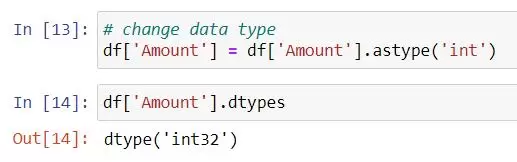
- astype() is particularly useful when you want to ensure that your data is in a specific data type, such as converting integers to floats or strings to integers.
In our dataset, the Amount column datatype was float64.
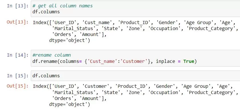
- rename() allows you to rename columns. Using the inplace=True parameter, the changes are applied directly to the DataFrame without needing to reassign it.
Visual Exploration: Create visualizations using matplotlib and seaborn. Craft histograms, scatter plots, and density plots to understand data distributions and relationships.
- describe() function is commonly used with Pandas DataFrames and Series to generate summary statistics of the data. It provides useful insights into the distribution and characteristics of the data, such as count, mean, standard deviation, minimum, maximum, and quartiles.
- countplot() function creates a bar plot that displays the count of each category in the data list.
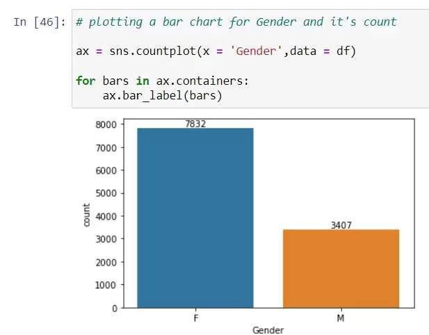
From the above graphs, we can see that most of the buyers are females.
- barplot() is used to create bar plots that visualize the relationship between a categorical variable and a numeric variable.
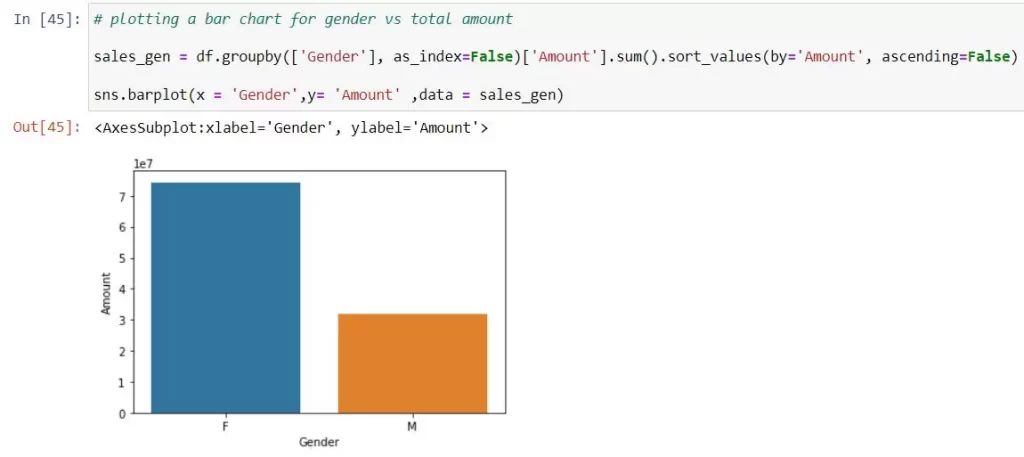
From the above graphs, we can see that females are spending more than males.
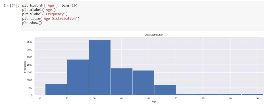
- hist() is a graphical representation of the distribution of a dataset. It shows the frequency of values falling within specific bins or ranges.
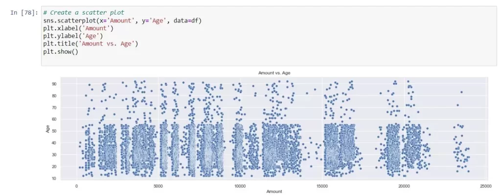
- scatterplot() is a graphical representation of data points in a two-dimensional space, where each data point is represented as a marker on the plot.
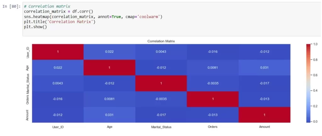
Exploring Relationships: EDA also involves examining relationships between variables. You can create correlation matrices, pair plots, and other visualizations to uncover how variables interact with each other.
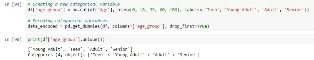
Feature Engineering: Feature engineering entails creating new variables from the existing ones to capture additional insights. This can include creating categorical variables from continuous ones, deriving new metrics, or encoding categorical variables.
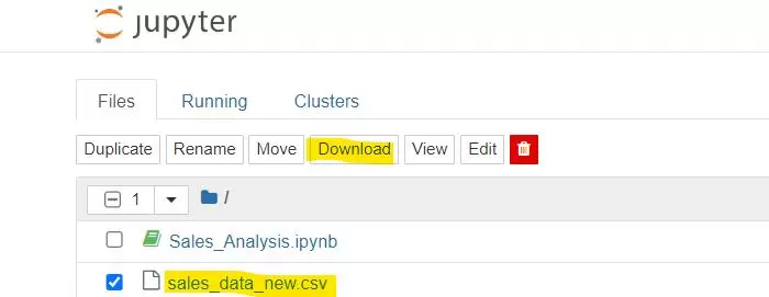
Data Integration and Export: Once your data is cleaned and transformed, export it as a clean CSV or Excel file. This ensures that your Tableau dashboard pulls from a reliable and standardized data source, reducing the chances of data discrepancies and inaccuracies.

With this step-by-step method and Python, you can tame the messy data that has been hindering your dashboard. Having tidy and structured data is crucial for creating stunning and insightful charts and graphs that help you comprehend your data and make smart decisions for your business. Remember, the quality of your data determines the quality of your insights, so spending time on proper data cleaning is always a worthwhile effort.