 Media Coverage
 Press Release
Mastering Tableau Containers: Best Practices for Dashboard Design
Best Practices for Using Tableau Containers to Enhance Dashboard Layouts
Maximizing Tableau Container Efficiency: Tips and Tricks for Designers
In my humble opinion, the most neglected learning area in Tableau dashboarding is working with its containers. Including me, most people who started off with Tableau, started with building visualizations on worksheets and eventually dropping them one by one onto the dashboard with our best guesses whether to use horizontal or vertical containers and many times not using one at all. The obvious implication of this is to have a torrid time at the eleventh hour adjusting the height, width, and placements of the respective visualizations once the dashboard is built and loaded with charts and filters.
Introduction to Tableau Containers and Their Importance in Dashboard Design
Designing Responsive Dashboards with Tableau Containers: Key Strategies
Organizing Content and Streamlining Workflow with Tableau Containers
Advanced Techniques for Leveraging Tableau Containers in Dashboard Development
Like me if you are also one of the many who can resonate with this topic, then this blog may just help you get it right with the Tableau containers the next time you build a dashboard. In this blog, I specifically talk about tiled dashboards with no floating objects and how to build dashboards right, right from step one.
Some of the very specific issues that this approach may help you get around have been described below:
- As the dashboard complexity increases, adding new sheets into the correct container at the exact location and setting the height and width becomes a huge challenge
- In many cases, when the sheet is placed into nested containers, you no longer see the option to set the height and width of the respective object
- The dashboard becomes very cumbersome to be maintained when the next business change comes in
- Last minute changes become very difficult as the dashboard objects would not behave the way you expect them to
- Formatting the objects would be a task of a different level altogether as you now have unwanted nested containers hindering you from getting that border or padding just right
Understanding the Role of Tableau Containers in Dashboard Layouts
Creating Flexible and Scalable Dashboard Designs with Tableau Containers
Tips for Optimizing Tableau Container Usage and Performance
Common Pitfalls to Avoid When Working with Tableau Containers
Below is the step-by-step guideline to help develop the right mindset for developing pixel perfect dashboard layouts:
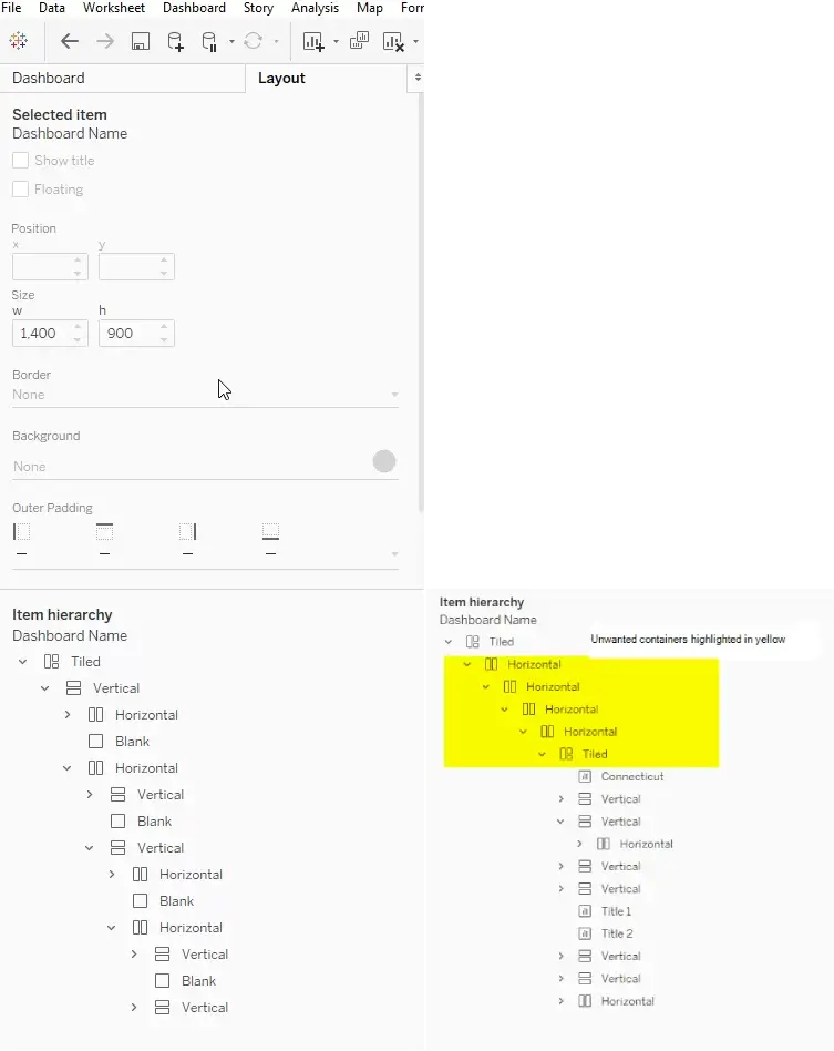
1. Familiarize yourself with the Layout window – Item hierarchy (see images below)
- Believe it or not this window can prove to be your best friend in getting the dashboard structure right
- The item hierarchy showcases the skeletal structure of the dashboard including the sheets and containers exactly as it is placed on the dashboard
- Pay attention to where the object is placed every time a new object is dropped onto the dashboard, be it a sheet or a container or any other item for that matter. It is best to catch and rectify in the early development stages. You see the item hierarchy grow as and when new objects are added to the dashboard and it is vital to ensure they grow right
- You can easily identify a poorly crafted item hierarchy when you start seeing unwanted nested containers (e.g. horizontal inside horizontal inside horizontal inside horizontal) or tiled container anywhere in the Item hierarchy but at the top (see right image below)
- Once you get a hang of this step, it becomes involuntary, and you may begin to skip this check during early stages
2. Mind map or even better if you could draw the dashboard blueprint on a piece of paper
- I have found this technique particularly useful as it gives clear direction on what container to be dropped and the respective sheets / objects that should be dropped into them
- It is not always possible to have a blueprint ready, nonetheless, if you can imagine the end dashboard in your mind it can prove to be immensely useful to get the structure right
3. Use the correct container object
- The next critical step is to pick the right container be it horizontal or vertical, hence it is immensely helpful to familiarize with the use and functionalities of both of them
- Beginners generally don’t apply much thought to this step and randomly pick one and start adding sheets into them, but this leads to poor and cumbersome dashboard designs when it comes to formatting, adjusting the size and placements of the objects
- This page provides an exhaustive overview of the layout containers and I recommend reading through in case you are just starting with containers
4. Keep an eye on unwanted containers that will creep into your Item hierarchy (right image from above) and get rid of them then and there
- If I could pin-point to the single most dangerous element that is primarily responsible for ruining the dashboard flexibility, then it would be the unwanted containers that sneak in (including the tiled ones)
- A tiled container works best only at the top of the item hierarchy and no place else, if you see one creep into the item hierarchy then right click and remove container immediately
- Please note: when you throw the 1st container (either horizontal or vertical) onto the dashboard, in addition to the selected container, you will observe a tiled container placed above it, this comes by default and this is the only tiled container that you can ignore and continue to work on without removing it ( it kind of helps you keep track of the top most point in your hierarchy once your dashboard design gets intricate)
- The other events when unwanted containers will creep into you item hierarchy is when you throw in sheets with filters and parameters enabled for them, hence as explained in step 1, it is best to check the item hierarchy every time a new object is dropped onto the dashboard to ensure the item hierarchy hygiene is maintained
- Once the unwanted filter / parameter container is removed from the dashboard, feel free to move the filter / parameter objects to the desired container object per your dashboard design blueprint
5. Final Tips
- Always fix the container height / width immediately after dropping them onto the dashboard so that you don’t lose the container when you drag the subsequent object into it. If you don’t and drop the sheet into the container, the container will wrap itself around the sheet making it rather difficult to identify the container boundary to drop the next object onto it
- I have found it useful to place a blank object as a placeholder when you plan to drop containers inside containers. It provides an easy demarcation and enables you to drag the next container either to the left or right in case of a horizontal parent container (or to the top or bottom in case of a vertical one). This eventually will ensure that the final objects are placed in the correct container. You can remove the blank object once all other objects have been placed inside the respective containers
- It can sometimes get very difficult to place objects into containers whose height or width are less than 50 pixels, you may find the object not dropping inside the container but outside it every time you try. The best work around this problem is, temporarily increasing the size of the container (at least more than the object size) and then dropping the object over the container. Once successful you can now reduce the size of the container
- Always try and use the height and width option to specify the exact pixel height and widths, rather than dragging the containers. This will help in building a high-quality visual dashboard with consistent object sizes
- Make use of the “Distribute contents evenly” container option
- Do check out this Workout Wednesday video by Andy Kriebel https://www.vizwiz.com/2021/03/mastering-containers.html
See it in Action:
Below is a tableau workbook designed specifically to illustrate how difficult it can get to do simple formatting changes. The tableau workbook has two similar looking dashboards in terms of the visualizations. For the benefit of the use case here, I named the 1st dashboard as “Bad Design” and the 2nd dashboard “Good Design”.
The ask here is to format the “Bad Design” dashboard to look exactly like the “Good Dashboard” and to do that, you we need the following cosmetic changes to the former:
- Set the top chart to a height of 125 pixels, the middle portion (map + filter) to 350 pixels and the lower part (two area charts) to 550 pixels
- Set the width for the map chart to be 1200 pixels and 200 pixels for the filter area
- Add black border to give a feel that the dashboard is divided into 3 distinct areas
Click here to Download “Containers – Good vs Poor Design.twbx”
Challenges to the above requirements on the “Bad Design” dashboard:
- You do not see the “Edit Height” option on any of the charts. Your best bet here is to drag the chart borders to adjust the height by trial-and-error
- Like the height option, you do not see the “Edit Width” option when you click on more options arrow of the chart
- To compartmentalize the dashboard uniformly, you need three distinct containers around the respective charts per area, since the “Bad Design” dashboard was developed ignoring the Item hierarchy, this becomes a time-consuming task (possible, but not worth the effort)
Quick Note to the All-Floating Camp:
The issues discussed above are specifically for tiled dashboard and does not apply to all floating objects dashboard. However, if you are using Automatic sizing with all floating dashboards, there is a chance that your objects may readjust and overlap one another when the screen size changes. In this case tiled is a much better option as the floating objects would require repositioning with the new relative x and y-coordinates for that screen. On the other hand, tiled objects fit in like pieces of puzzle, if you adjust the size of one, the other objects resize to accommodate the change. In my opinion, one approach is not better than the other, however, working with tiled object is easier than floating as you do not have to worry about the x-y coordinates or chances of objects overlapping each other and just deal with the height and width of the object. Dashboard maintenance and future changes are also easier to be incorporated in a well-designed tiled dashboard and hence, mastering the skill of using containers precisely cannot be overstated.
Thank you for reading through and I hope this blog was able to guide you in the right direction.