 Media Coverage
 Press Release
Exploring Flowing Data’s Top Data Visualization Projects of 2016
The Best of 2016: A Review of Flowing Data’s Top Data Visualization Projects
Unveiling the Most Captivating Data Visualization Projects of 2016
Visualization continues its merging into the everyday — less standalone and more of a medium that blends with words. I think this is partially because of a concentration on mobile. There’s simply less visual space on a phone than there is a giant computer screen, so the visualization is stripped or split up into smaller pieces that are more easily digested while scrolling.
Whereas last year seemed exploratory and long explainer-ish, this year was nimble and quickfire. Or maybe this year’s election season is still fresh in my mind. I can’t be sure.
I am sure though that there were a lot of good projects this year. Below are my favorites in no particular order.
Diving into Flowing Data’s Selection: A Closer Look at Top Data Viz Projects
Innovative Data Visualization in Review: Flowing Data’s Picks of 2016
From Charts to Maps: Exploring Flowing Data’s Notable Visualizations of 2016
Insights from Flowing Data: Highlights of the Best Data Viz Projects from 2016
Interactive Data Storytelling: Examining Flowing Data’s Top Picks of 2016
Visualizing Trends: A Deep Dive into Flowing Data’s Data Viz Selections
From Information Design to Storytelling: Flowing Data’s Most Memorable Projects of 2016
Exploring the Art of Data Visualization: Flowing Data’s Noteworthy Projects from 2016
The Evolution Of Bacteria On A “Mega-Plate” Petri Dish

Bacteria evolve and grow impervious to drugs over time. Researchers at Harvard Medical School used a giant petri dish to show the process. They put increasing dosages of antibiotics on the dish, outside in, and then let the bacteria go. So simple, but the resulting time-lapse was so effective. (See the project.)
Guess The Correlation
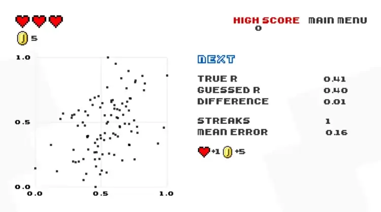
A game that helps you learn statistics? That sounds good to me. (See the project.)
Twenty Years Of The Nba Redrafted
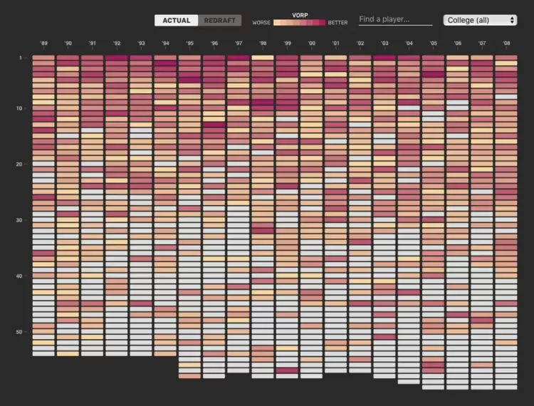
Polygraph, known for its visual essays, hit its stride this year. This one on drafting basketball players communicated tricky statistical concepts in a relatable and playful way. (See the project.)
The Movingness Of Drought
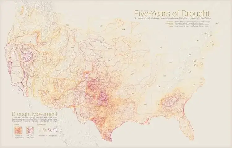
Animation isn’t the only way to show movement. John Nelson did good work this year over at Adventures in Mapping. (See the project.)
Temperature Compared To Average
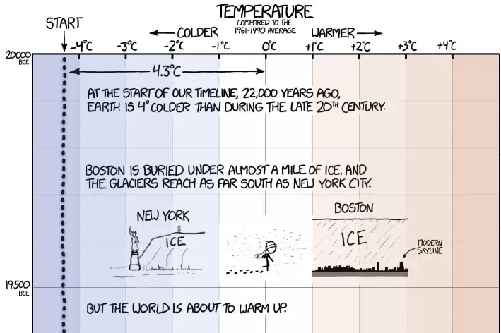
There’s something about mixing comics and depth that makes xkcd pieces so memorable and relatable. (See the project.)
Gun Deaths In America

Big numbers are difficult to imagine. How can you imagine a billion? Even a thousand things collectively is a challenge. Gun death numbers are big, but the individual events are also significant, which requires care. FiveThirtyEight broke it down in a way that helps with the mental scaling issues. (See the project.)
The Voting Habits Of Americans Like You
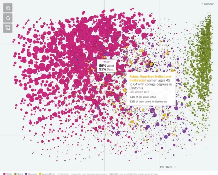
I made some things with demographic subsets this year, but it never occurred to me to show all of them at once. Nate Cohn and Amanda Cox for The Upshot did just this, showing the voting habits of various demographic groups and their shifts between 2004 and 2012. There were a lot of data points to take in, but it didn’t feel overwhelming. (See the project.)
A Field Guide To Red And Blue America
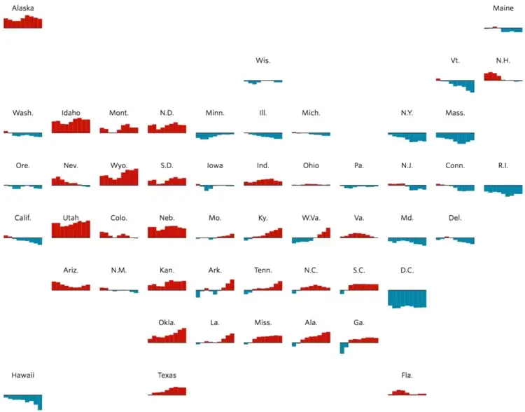
When election season comes around, the state grid map comes out to play. The Wall Street Journal used the grid as a way to show time series small multiples. The format worked well for the data they showed. (See the project.)
How Trump Redrew The Electoral Map, From Sea To Shining Sea
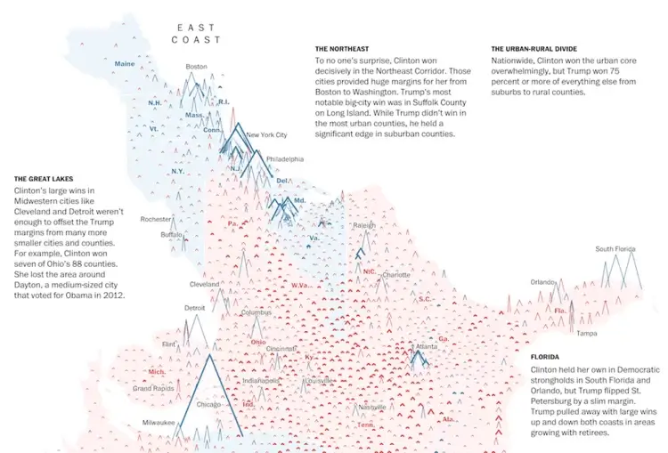
The novel encoding from The Washington Post used a peaks and valleys metaphor to show voter margins. To make it work, they turned the United States sideways. I’m curious how the general public digested the non-standard encoding. I liked it. (See the project.)
The Rhythm Of Food
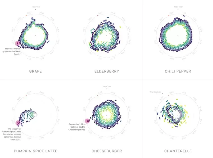
It’s about food patterns over time. You had me at food.
Image Credit – Flowing Data